Sekilas Wujud Android Versi 3.0
Android 3.0 adalah versi baru dari platform Android yang dioptimalkan secara khusus untuk perangkat dengan ukuran layar yang lebih besar, terutama tablet. Google menciptakan sesuatu yang baru pada adroid os kali ini, menampilkan sebuah wujud virtual dan “hologram”, serta model, interaksi elegan konten yang terfokus.
Android 3.0 dibangun pada hal-hal orang senang paling tentang Android, multitasking yang halus dan elegan, kaya informasi, layar Home yang dapat di-custom, widget, dan banyak lagi yang lainnya,,,, Hal tersebut jelas akan menambah pengalaman dalam berinterkasi dengan sesuatu yang berbau 3D dan membuat kita lebih akrab terhadap os ini dari sebelumnya.
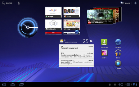
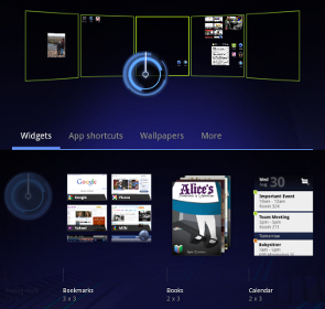
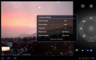
Berikut Penampakannya:


Source: Android Official Site
New UI designed from the ground up for tablets
Android 3.0 is a new version of the Android platform that is specifically optimized for devices with larger screen sizes, particularly tablets. It introduces a brand new, truly virtual and “holographic” UI design, as well as an elegant, content-focused interaction model.
Android 3.0 builds on the things people love most about Android — refined multitasking, rich notifications, Home screen customization, widgets, and more — and transforms them with a vibrant, 3D experience and deeper interactivity, making them familiar but even better than before.
The new UI brings fresh paradigms for interaction, navigation, and customization and makes them available to all applications — even those built for earlier versions of the platform. Applications written for Android 3.0 are able to use an extended set of UI objects, powerful graphics, and media capabilities to engage users in new ways.
System Bar, for global status and notifications
Across the system and in all applications, users have quick access to notifications, system status, and soft navigation buttons in a System Bar, available at the bottom of the screen. The System Bar is always present and is a key touchpoint for users, but in a new “lights out mode” can also be dimmed for full-screen viewing, such as for videos.
Action Bar, for application control
In every application, users have access to contextual options, navigation, widgets, or other types of content in an Action Bar, displayed at the top of the screen. The Action Bar is always present when an application is in use, although its content, theme, and other properties are managed by the application rather than the system. The Action Bar is another key touchpoint for users, especially with action items and an overflow dropdown menu, which users frequently access in a similar manner in most applications.
Customizable Home screens
Five customizable Home screens give users instant access to all parts of the system from any context. Each screen offers a large grid that maintains spatial arrangement in all orientations. Users can select and manipulate Home screen widgets, app shortcuts, and wallpapers using a dedicated visual layout mode. Visual cues and drop shadows improve visibility when adjusting the layout of shortcuts and widgets. Each Home screen also offers a familiar launcher for access to all installed applications, as well as a Search box for universal search of apps, contacts, media files, web content, and more.
Recent Apps, for easy visual multitasking
Multitasking is a key strength of Android and it is central to the Android 3.0 experience. As users launch applications to handle various tasks, they can use the Recent Apps list in the System Bar to see the tasks underway and quickly jump from one application context to another. To help users rapidly identify the task associated with each app, the list shows a snapshot of its actual state when the user last viewed it.
Redesigned keyboard
The Android soft keyboard is redesigned to make entering text fast and accurate on larger screen sizes. The keys are reshaped and repositioned for improved targeting, and new keys have been added, such as a Tab key, to provide richer and more efficient text input. Users can touch-hold keys to access menus of special characters and switch text/voice input modes from a button in the System Bar.
Improved text selection, copy and paste
When entering or viewing text, a new UI lets users quickly select a word by press-hold and then adjust the selection area as needed by dragging a set of bounding arrows to new positions. Users can then select an action from the Action Bar, such as copy to the clipboard, share, paste, web search, or find.
New connectivity options
Android 3.0 includes new connectivity features that add versatility and convenience for users. Built-in support for Media/Picture Transfer Protocol lets users instantly sync media files with a USB-connected camera or desktop computer, without needing to mount a USB mass-storage device. Users can also connect full keyboards over either USB or Bluetooth, for a familiar text-input environment. For improved wi-fi connectivity, a new combo scan reduces scan times across bands and filters. New support for Bluetooth tethering means that more types of devices can share the network connection of an Android-powered device.
Updated set of standard apps
The Android 3.0 platform includes an updated set of standard applications that are designed for use on larger screen devices. The sections below highlight some of the new features.
Browser
The browser includes new features that let users navigate and organize more efficiently. Multiple tabs replace browser windows and a new “incognito” mode allows anonymous browsing. Bookmarks and history are presented and managed in a single unified view. Users can now choose to automatically sign into Google sites on the browser with a supplied account and sync bookmarks with Google Chrome. New multitouch support is now available to JavaScript and plugins. Users can enjoy a better browsing experience at non-mobile sites through an improved zoom and viewport model, overflow scrolling, support for fixed positioning, and more.
Camera and Gallery
The Camera application has been redesigned to take advantage of a larger screen for quick access to exposure, focus, flash, zoom, front-facing camera, and more. To let users capture scenes in new ways, it adds built-in support for time-lapse video recording. The Gallery application lets users view albums and other collections in full-screen mode, with easy access to thumbnails for other photos in the collection.
Contacts
The Contacts app uses a new two-pane UI and Fast Scroll to let users easily organize and locate contacts. The application offers improved formatting of international phone numbers as user types, based on home country and an international number parsing library. Contact information is presented in a card-like UI, making it easier for users to read and edit contacts.
Email
The Email application uses a new two-pane UI to make viewing and organizing messages more efficient. The app lets users select one or more messages, then select an action from the Action Bar, such as moving them to a folder. Users can sync attachments for later viewing and keep track of email using a home screen Widget.
Android memang keren. pengen beli tai belum ada uang, thanks
bisa-bisa gadged dan komputer dikuasai android
Ane mau tanya gan….
kalo Kelebihan dan kekurangan Android dari pada sistem yang lain ap ya?
woooooooooooowwww
keren banget…..
hrganya ada dikisaran brp?
Kapan yah kira2 diluncurkan ke pasaran??? atau sudah keluar???
nice article kepp it up and thanks for it
wah kalo yang ini mah mang keren abies..
Android memang oke punya om. Ane dah punya.
mantapp klo punya android. !!
canggih
pengen bgd punya android, blm kesampaian.. -_-
bisa makin gagah nh penampilan gw
ya kan
hehehe
tengkyu gan infonya
waw keren abis gan .